Traceport

Brand and product design for nonprofits to track, verify, and report their impact.

Role

Brand & Product Designer

Industry

B2B Software

Duration

8 weeks

app screen mockup
app screen mockup
app screen mockup

Context

Traceport is a transparency tool built for charities to record, verify, and report their funding in real time. As the brand and product designer on this project, I was responsible for the end-to-end design of the Charity User MVP — from the brand identity to the entire platform interface.

The challenge was to create a trustworthy, efficient platform that helps nonprofits stay accountable to funders while reducing reporting pain. Designed within a 4-week sprint as part of Block Dojo’s incubator, this MVP was aimed at laying the foundation for future iterations and investment.

Brand Logo, type, Colour Usage
Key brand application inside the platform

The Challenge

Nonprofits often rely on outdated systems like spreadsheets or email trails to track grants and deliver reports. This leads to:

  • Lack of real-time fund visibility

  • Difficulty verifying use of funds

  • Poor communication with donors and board members


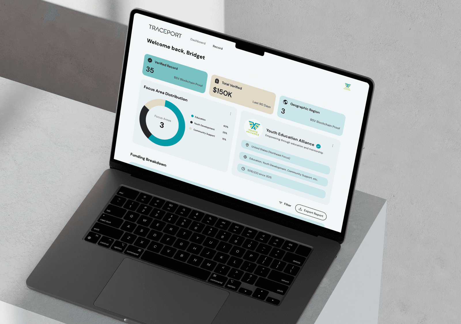
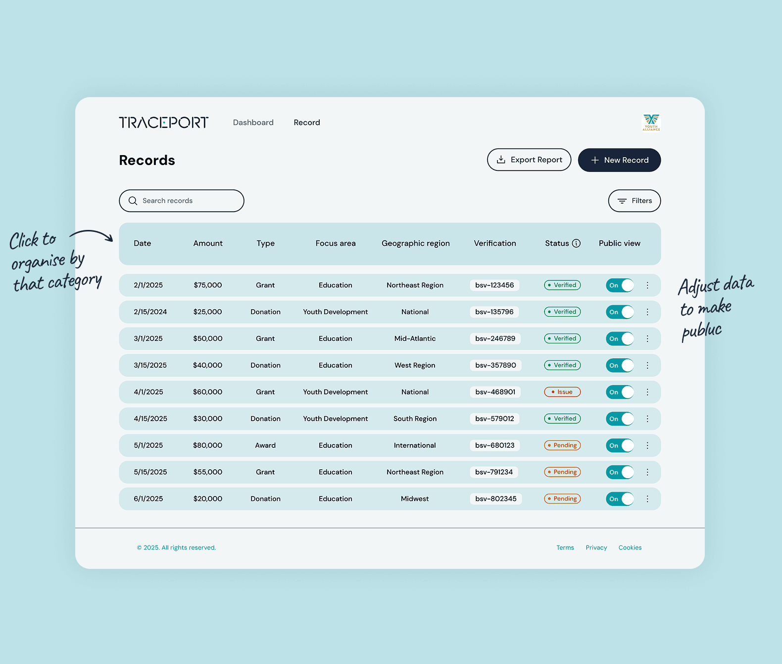
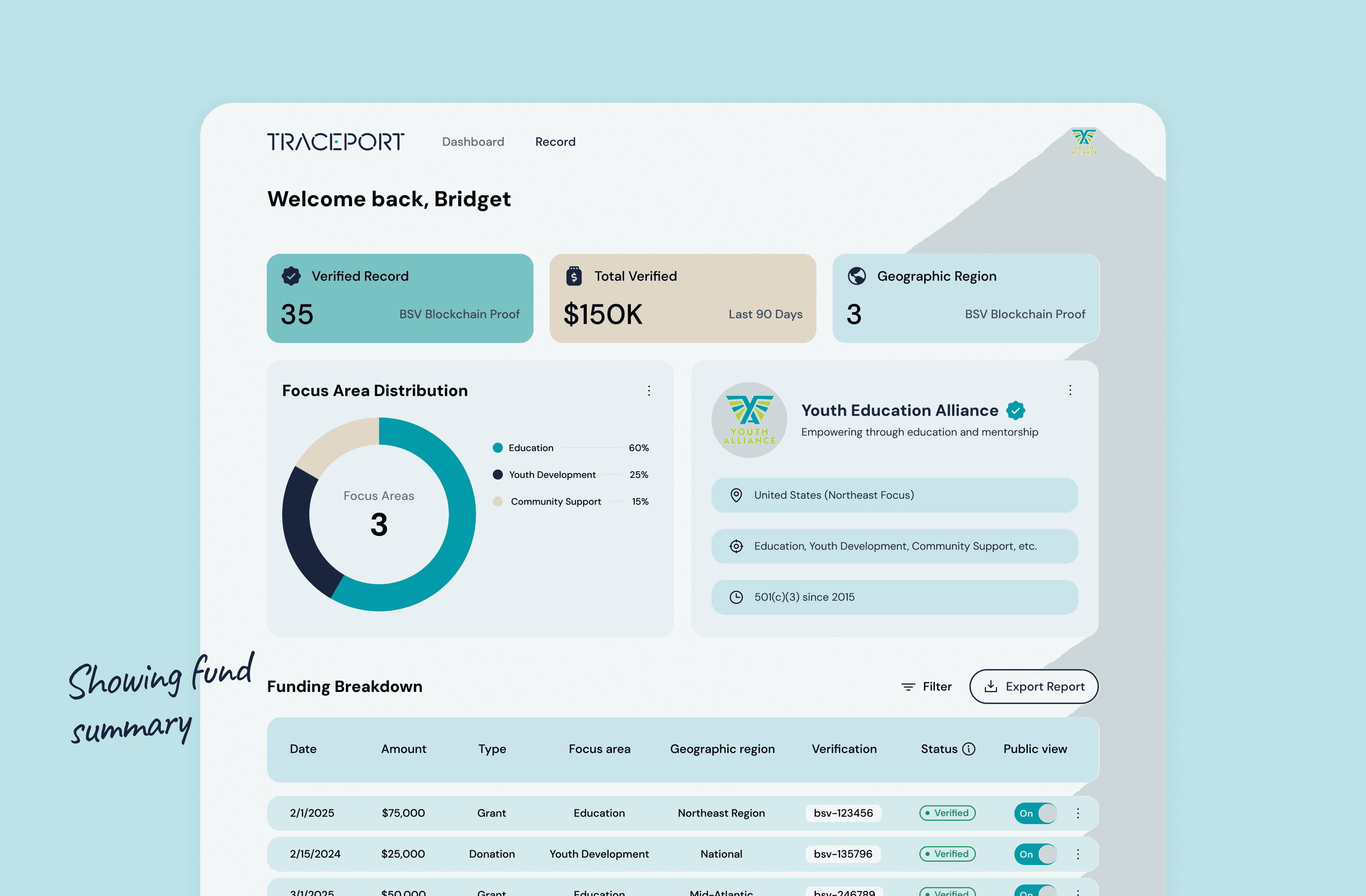
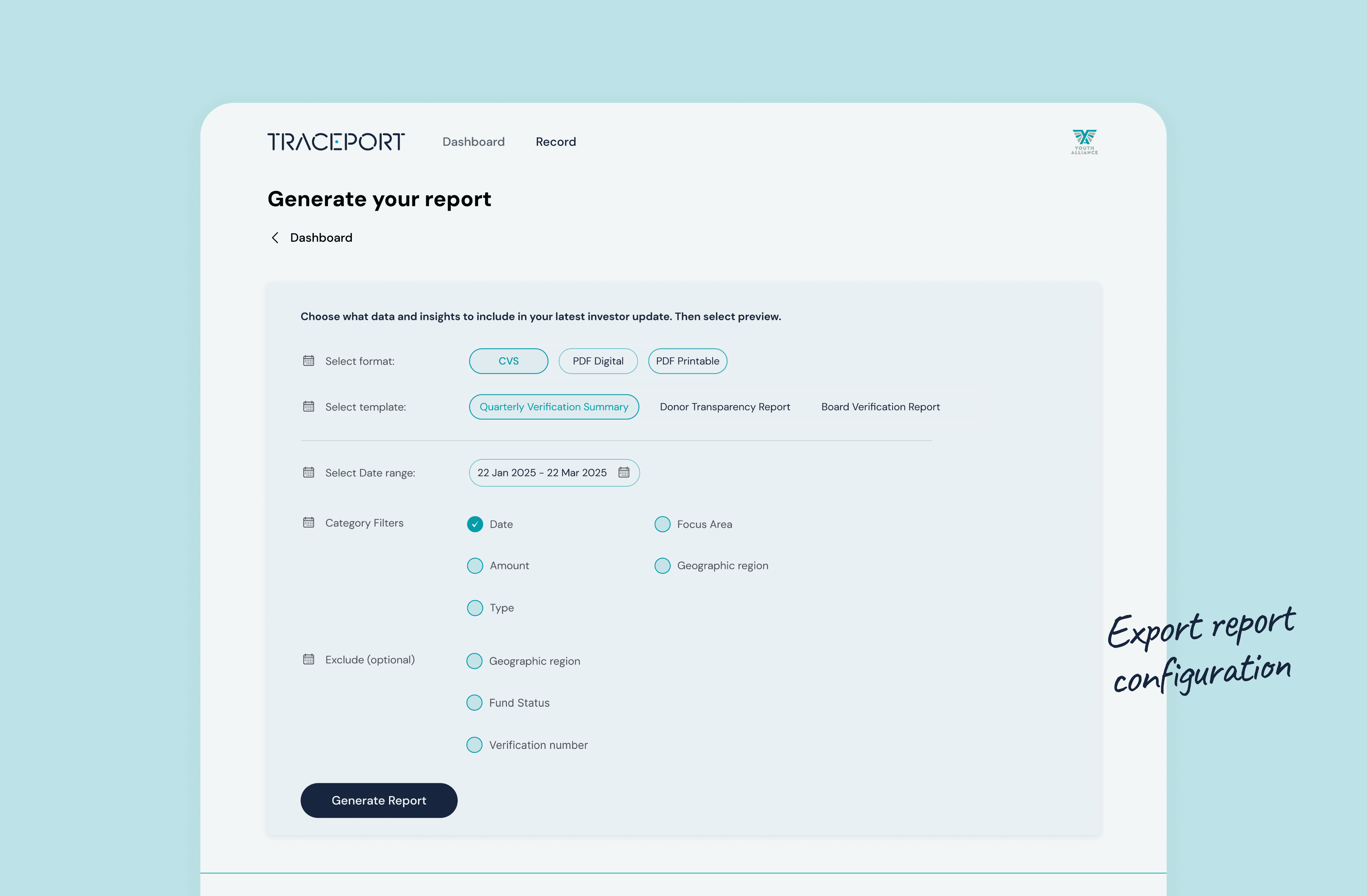
Our goal was to solve these pain points through a clean, intuitive product — designed with trust, clarity, and usability at its core.

The record screen
The record screen
The record screen
Manual upload showing colour cues

The Design Process

The charity-side MVP includes five core features:

1. Dashboard — Displays fund summary, org info, and a donut chart breaking down focus areas.

2. The Record — A central hub for funding activity, where users can upload new records manually or in bulk.

3. Manual Upload Flow — A guided, multi-step form designed with tooltips, status indicators, and inline hints to ease complex data input.

4. Bulk Upload Flow — A simple 4-step system allowing users to fill out a pre-structured CSV template, verify the data, and submit with confidence.

5. Export Report — Users can generate donor- or board-facing reports by selecting a template, date range, and specific fund criteria.

Throughout the process, I made UX decisions that prioritise ease of use, such as sectioned input, colour-coded progress states, and flexible reporting options.

Full Dashboard Screen
Manual Upload Flow
Manual Upload Flow
Manual Upload Flow
Preview Generated report

Result

The MVP was well received by the founder and the Block Dojo team. The UI not only showcased Traceport’s USP clearly, but also set a credible tone for investor conversations. The charity interface now serves as a strong foundation for the next phase, which includes a donor-facing portal and deeper verification features.

Key Takeaways

Clear UX is especially critical when the product deals with complex, sensitive data

  • Early-stage MVPs benefit from scalable, flexible UI systems

  • Brand trust and product usability must go hand in hand in fintech and nonprofit tools

Other projects

Lily Lalita Digital Designer

Let’s talk projects, collaborations, or anything design!

lily.lalita.design@gmail.com

Lily Lalita Digital Designer

Let’s talk projects, collaborations, or anything design!

lily.lalita.design@gmail.com

Lily Lalita Digital Designer

Let’s talk projects, collaborations, or anything design!

lily.lalita.design@gmail.com